
Bayesian Changepoint Analysis of PPR Water Levels
Published:
One of the most wonderful recent developments in computational statistics is explosion of probabilistic programming frameworks. These allow for incredibly flexible statistical (and usually Bayesian) models that more accurately fit the systems that we study even if the conceptual model of the system can be complicated. Some of the better known frameworks include Stan, Edward and PyMC3. In this notebook, I am using PyMC3 in Python to fit a regression model incorporating an unobserved switchpoint. The general idea is that we know that some sort of structural change happened over the course of our data collection and we want to know when/where this occurred with accompanying uncertainties.
Specifically, I am using this model to better understand the timing of large-scale changes in the distribution of ponds and wetlands in the North Dakota portion of the Prairie Pothole Region (PPR). For a brief introduction, I recommend looking at one of my earlier posts. I’ve downloaded large amounts of Landsat-derived spatial data on the presence or absence of water at a 30 m. resolution provided by a collaboration between European scientists and Google which resulted in a 2016 Nature paper. I can’t recommend their work enough–it has really opened up the possibilities for long-term surface water monitoring in a way that simply wasn’t possible before. I have reduced that dataset over the ND PPR by calculating the total surface area and total surface perimeter of all the water bodies in the region. This data was aggregated from a monthly to an annual timescale by simply identifying all pixels which ever held water within a given year and treating that as the annual data layer. The next few code cells import some dependencies and make a plot of the per-year water extent in terms of surface area and surface perimeter from 1984-2015.
Preliminaries
import numpy as np
import theano.tensor as tt
import pandas as pd
import pymc3 as pm
import matplotlib.pyplot as plt
import warnings
warnings.filterwarnings("ignore")
%matplotlib inline
PyMC3 is built upon Theano, a powerful numerical tensor library that was originally developed for training neural networks. Using PyMC3 with Theano is akin to scikit-learn with numpy as some operations need to be done in a lower-level numerical framework. PyMC3 uses Theano to calculate gradients of the model likelihood to enhance MCMC sampling though this model won’t depend on that feature. Pandas is just used to import some data. I have also knocked out the warning for this session though this is generally a bad idea.
filepath = '/home/ubuntu/Dropbox/wetland_inventory/data/pickles/counties_5_16.p'
counties = pd.read_pickle(filepath)
subset = counties[counties.STATEFP == '38'] # Picks out counties belonging to North Dakota (state code 38)
p = (np.array(subset.perimeters.values.tolist()).sum(axis=0)) # Adds up water surface area, perimeter from each county
a = ((np.array(subset.areas.values.tolist()).sum(axis=0))**0.5)
plt.scatter(p[0:15],a[0:15],color='c',label='Pre-2000')
plt.scatter(p[15::],a[15::],color='m',label='Post-2000')
plt.legend(loc='upper left')
plt.ylabel('Total water body area$^{1/2}$ (m.)'),
plt.xlabel('Total water body perimeter (m.)')
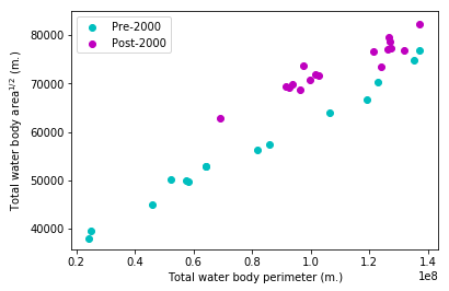
Note that I have plotted the square root of the water area versus the perimeter; this makes the slope of any line plotted above into a dimensionless parameter. I have also taken the liberty of splitting up my data points into two populations based on a wild guess. As we can see, there does appear to be two separate groups which could each get their own linear regression. My next move is to enumerate a PyMC3 model that tells me what year is the most likely year of a split demarcating the points into a before and after group. While PyMC3 normally uses a variant of Hamiltonian Monte Carlo (an extremely effective variant of MCMC), the changepoint parameter in our model has a non-differentiable likelihood so we cannot use HMC.
Model fitting and summaries
x = a / np.mean(a)
y = p /np.mean(p)
year = range(1984,2016)

with pm.Model() as switchpoint_model:
    sigma = pm.HalfCauchy('sigma', beta=0.25)
    switchpoint = pm.DiscreteUniform('switchpoint',lower=1986,upper=2013)

    alpha1 = pm.Flat('alpha1')
    alpha2 = pm.Flat('alpha2')
    beta1  = pm.HalfFlat('beta1')
    beta2  = pm.HalfFlat('beta2')
    intercept = tt.switch(switchpoint < year, alpha1, alpha2)
    beta      = tt.switch(switchpoint < year, beta1, beta2)

    likelihood = pm.Normal('y', mu=intercept + beta * x, sd=sigma, observed=y)
    trace = pm.sample(10000, step=pm.Metropolis(), njobs=2)
100%|██████████| 10500/10500 [00:48<00:00, 215.17it/s]
The probabilistic structure of our model assumes that the changepoint can be any year between 1986 and 2013 and that the before/after periods get their own linear regression fit with a relatively tight prior distribution on the variance. Then, I fit the model with the built-in Metropolis sampler that comes with PyMC3. Next, I want to make sure that the model has converged using the Gelman-Rubin diagnostic which tests whether the intra-chain variance is similar to the inter-chain variance. Essentially, this just makes sure that samples from two different chains could plausibly have come from the same chain.
pm.gelman_rubin(trace)
{'alpha1': 1.0151068533730134,
 'alpha2': 1.0004765453141244,
 'beta1': 1.0148456140559712,
 'beta2': 1.0003276532498642,
 'sigma': 1.0063660600617652,
 'switchpoint': 0.99999589021554791}
Since these are all very close to one, the MCMC sampler appears to be well-mixed and we have drawn our samples from the posterior distribution over the parameters. Let’s take a look at them and see what we find. We’ll focus on the switchpoint and variance parameters to begin with.
_ = pm.plot_posterior(trace,varnames=['switchpoint','sigma'])
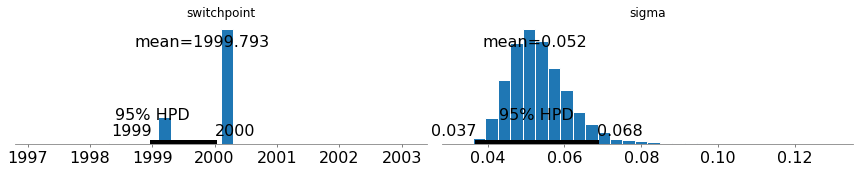
Since sigma is very low, we can conclude that the errors in this model are relatively low and we are getting tight linear fits. Furthermore, the switchpoint variable’s probability mass is mostly concentrated in 2000 with a little bit left over in 1999.
The next cell shows the Monte Carlo uncertainties associated with the linear regression fits for each period. I have only plotted 100 samples.
plt.scatter(x,y,color='k')
plot_x = np.linspace(min(x),max(x))
for i in range(9900,10000):
    if i == 9900:
        plt.plot(plot_x,plot_x*trace['beta1'][i]+trace['alpha1'][i],color='c',label='Pre-change')
        plt.plot(plot_x,plot_x*trace['beta2'][i]+trace['alpha2'][i],color='m',label='Post-change')
    else:
        plt.plot(plot_x,plot_x*trace['beta1'][i]+trace['alpha1'][i],color='c',alpha = 0.01)
        plt.plot(plot_x,plot_x*trace['beta2'][i]+trace['alpha2'][i],color='m',alpha = 0.01)
plt.legend(loc = 'upper left')
plt.ylabel('Normalized Area')
_ = plt.xlabel('Normalized Perimeter')
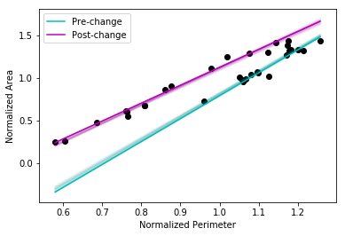
Once more, we see very tight credible intervals for the regression lines - the model appears to be doing a good job of demarcating the before/after periods with high certainty. This appears to be an open-and-shut case with little ambiguity. The representation of water bodies in time as measured via perimeter and surface area is conveniently handled with a dimensionless relation and tells us that:
- After 2000, for the same amount of shoreline, more surface water area existed (i.e. the storage was greater), and
- This may be a hysteretic effect since the jump from pre- to post- change happened in the upper right quadrant of the system space in which water is extremely abundant.
This is part of an ongoing study into the surface water dynamics of the Prairie Pothole Region and more posts will be up shortly.